Online Giving
End of 2021 – End of 2023
This page is still a work in progress as I build out my portfolio.
But here are a few examples of tactical work I’ve done, both released and not. Each image will be preceded by a brief description.
Background
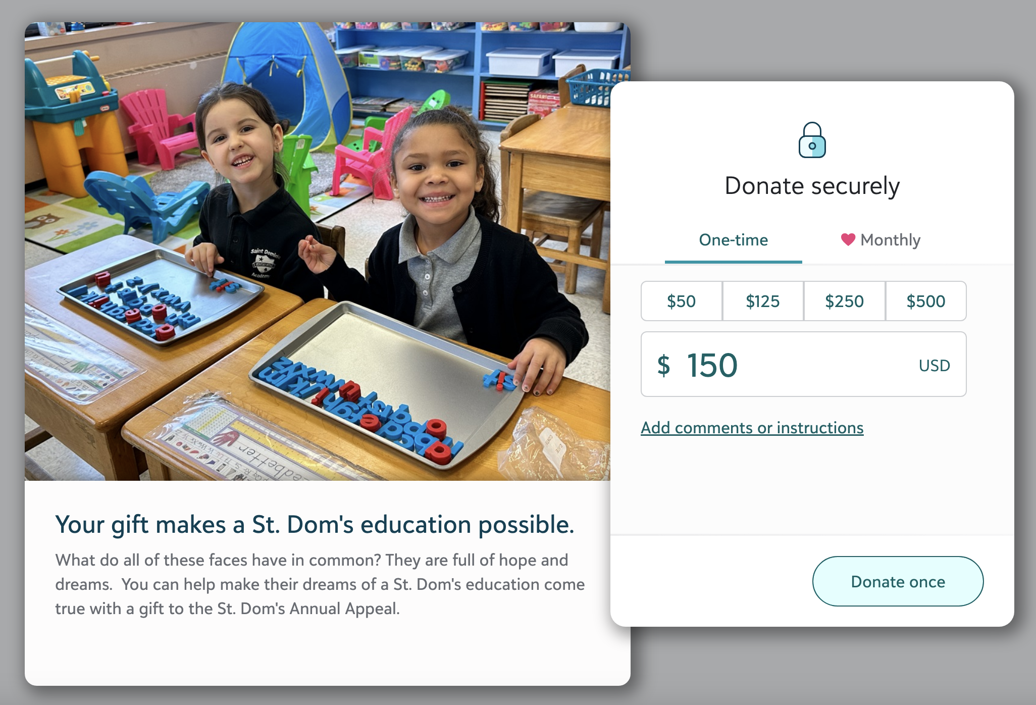
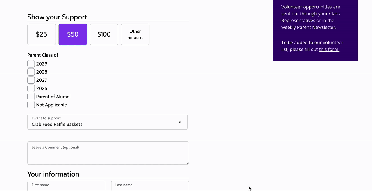
Online Giving is the name of the feature area in our flagship fundraising product that handles online donation form creation, maintenance, and analysis. To stay competitive and keep up with emerging trends in digital fundraising, design resources were allocated and dedicated to reimagining both the administrative side of this experience, and the donation forms themselves. Immediately below, you can see our newer “optimized form” on the left, as well as our older “standard form” on the right. The optimized form launches on top of other content on a customer’s website, and is focused on being low-customization, high-conversion, and high-optimization. The standard form by contrast is embedded directly into a page on a customer’s website, and is highly configurable and fairly flexible, but not nearly as easy to run A/B tests on or draw decisive conclusions from.
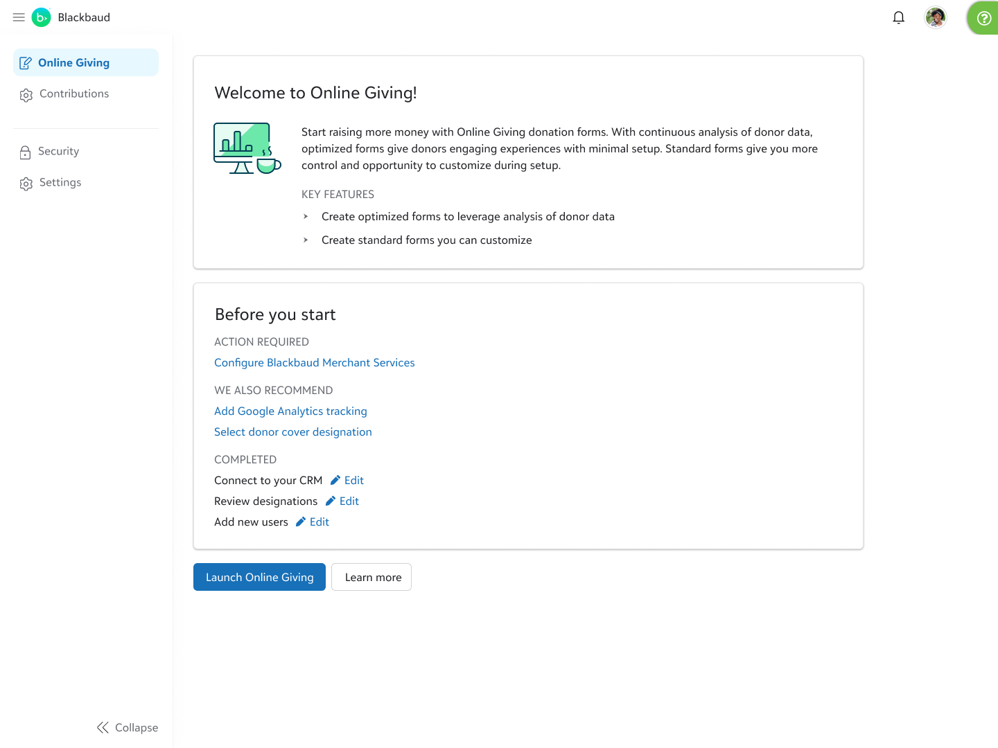
Splash page
Online Giving ended up existing in the navigation for our Raiser’s Edge product, but early on it was released as an “app”, accessed separately through a users’s service selector. First-time use and onboarding are still things Blackbaud is getting its feet wet with, and we led part of that charge by designing a page that users would land on before they entered the feature, which told them a bit about what it was, what they needed to do before they could fully leverage it, and what we recommended.
(This page has been completely built)
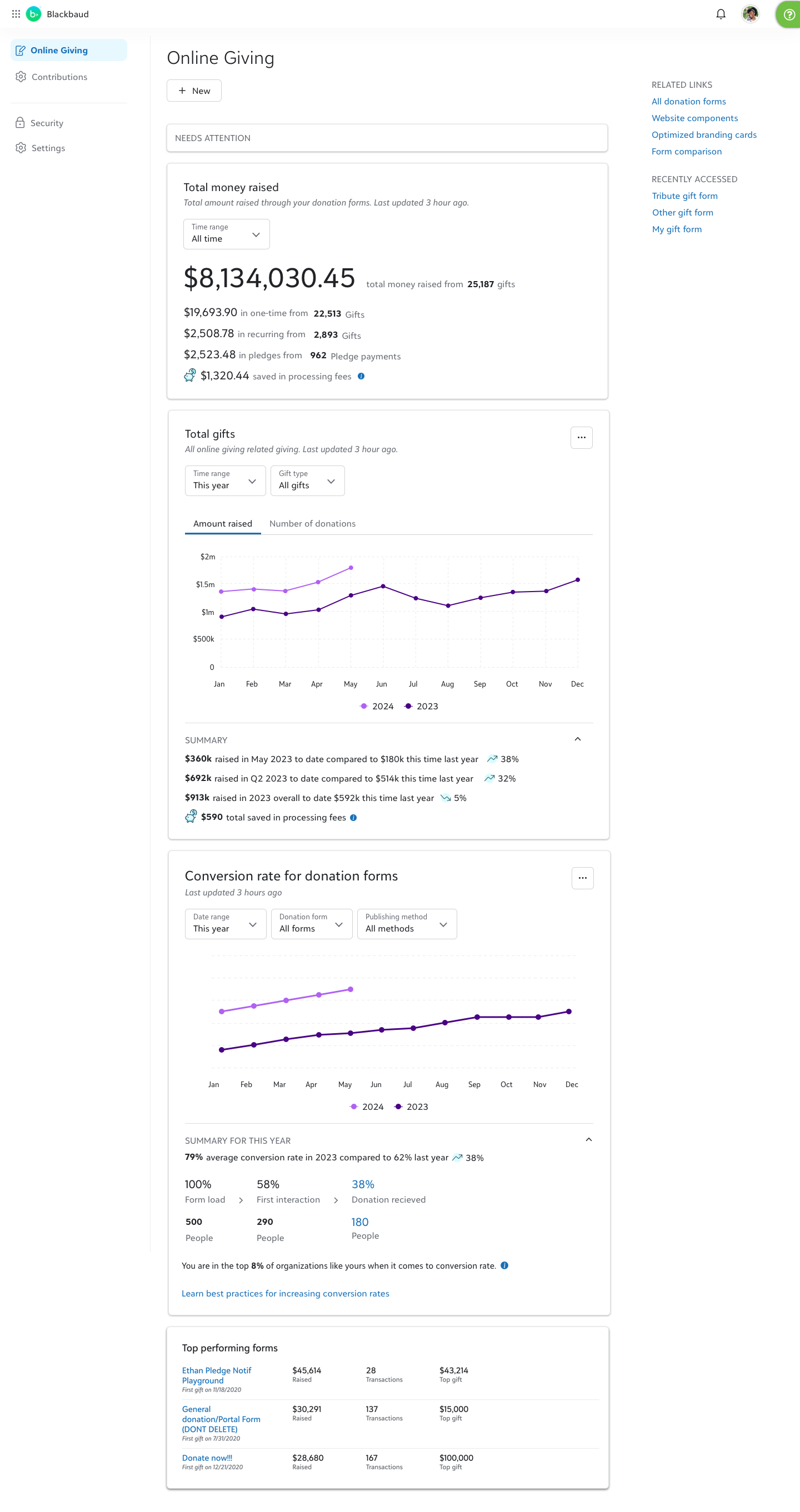
Action hub
Through discovery, we learned that a lot of value in a homepage for our donation forms tools would be something that this database administrators, frequently tasked with setting up donation forms, could show to fundraisers who worked with them, as well as the management and executive levels that they reported to. Through multiple rounds of discovery we distilled which pieces of information were the most valuable to show, and through which lenses they needed to be able to view that information.
(This page has been mostly built)
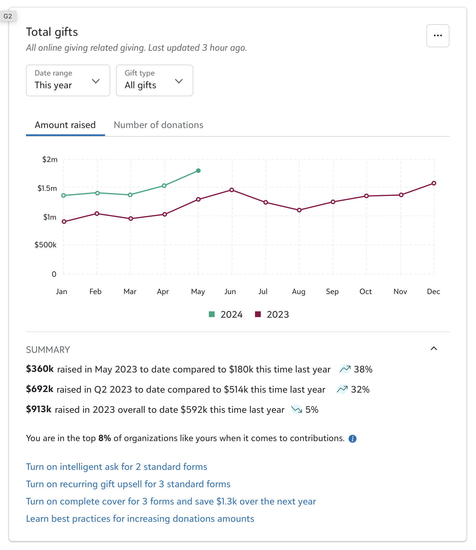
Action hub (future detail)
This graph and its associated content mostly resembles examples you just saw above. The additional value here are the pieces of link text at the bottom of the box, which make recommendations about what a user can do to get more out of their forms, and how to engage more deeply with the solution. Were we can, we will tie those actions directly to additional funds they can expect, as well as call out more general best practices we’d encourage them to adopt.
(These pieces have been partially built)
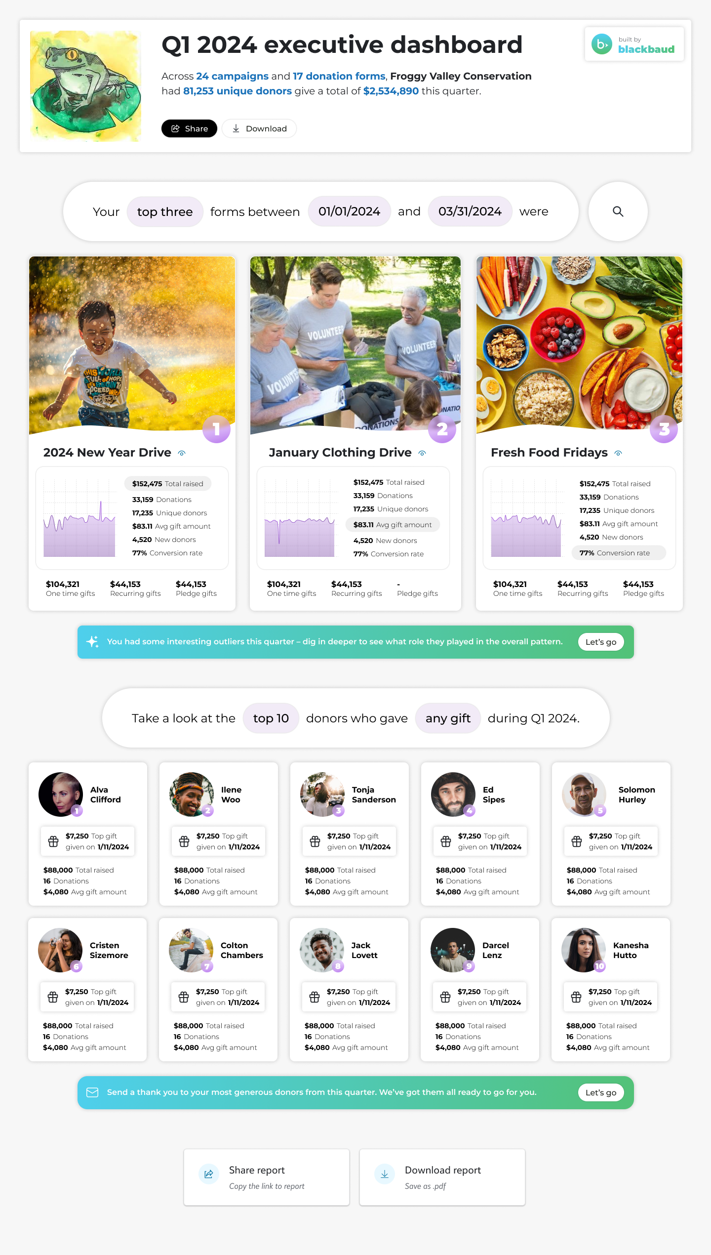
Executive summary (future detail)
A big part of what regular users of this area are asked to do is gather information together for leadership. Today, we can show certain key metrics over time, but a deeper dive requires quite a bit of manual effort from the user to pull the analytics that executives want to be shown.
I designed a page that will save those users time pulling that data, in a way that also creates a much more digestible deliverable for executive leadership. Users in discovery were very excited to see it, and it would create a template that we’d be able to reuse in other areas – a Spotify-Wrapped style summary page that allows an organization to dig more deeply into what’s going on within different parts of their operation at regular intervals, without a bunch of manual tooling to pull the information.
This mock up is a proof of concept, and while we’ve had conversations about building an MVP of this, it hasn’t made it into a roadmap yet. But a lot of ideas at Blackbaud garner initial excitement, and then have to simmer for a few years before there’s an appetite and ability to develop them, and I’m confident we’ll eventually have something like this in product.